ArtHStore
Website Accessibility and Usability Review
Contents
Overview of evaluation
Opportunities
Recommendations
Overview of evaluation
Top 3 opportunities
1 . Add meaningful Alt Text
Helps visually impaired users understand images and improves SEO.
2 . Enhance text contrast
Make content more readable for users.
3 . Improve Existing Content
Ensure logo visibility and adjust the appearance of actionable text.
Recommendations
Meaningful Alt Text
The product images lack alternative text, which makes them inaccessible to users who rely on assistive technology to interact with the website.
This prevents customers who cannot see the screen from making informed purchases, ultimately leading to a loss of sales.
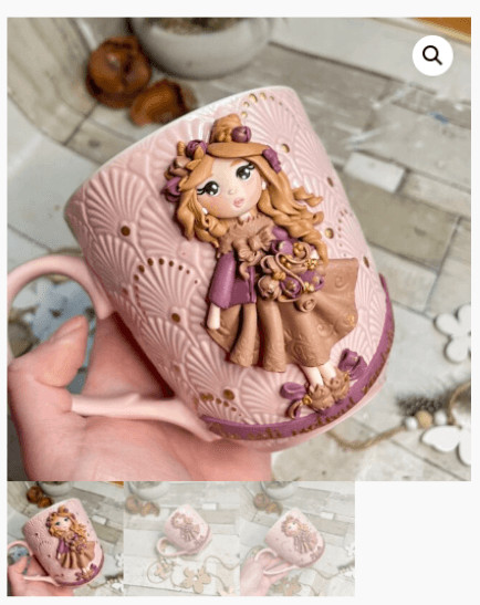
As an example, the alternative text for this image could be "Pink polymer mug with a 3D doll of a girl holding flowers, 350 ml".
Also, a search engine can’t see photos independently, so if the technology can understand these images through alt text, the product will likely appear in a search.
Without alternative text, the website risks losing visibility and potential customers.
Enhance text contrast
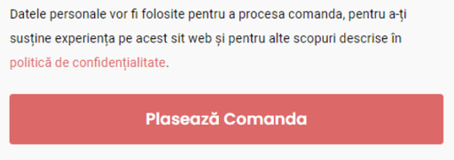
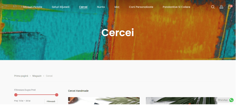
Body and some other small text areas on the website fail to meet the minimum color contrast required by the Web Content Accessibility Guidelines (at least 4.5:1).
Users may miss important information, leading to frustration and potential loss of customers.
Contrast ratio 3.18 : 1
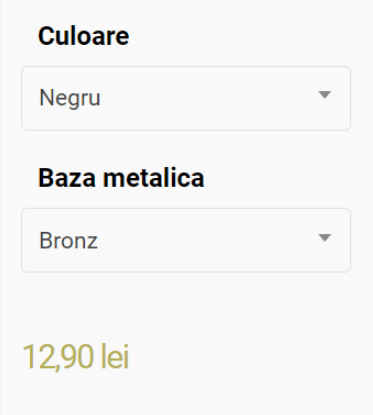
Contrast ratio 2.17 : 1
Improve existing content
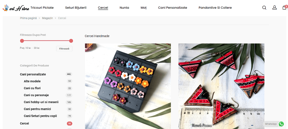
3.1 Ensure logo visibility
The logo does not appear untill scrolling down. The logo helps with brand recognition and often serves as a navigational element that users expect to click to return to the homepage, improving site navigation and user experience.
3.2 Adjust the appearance of actionable text
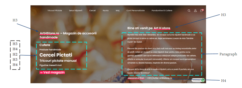
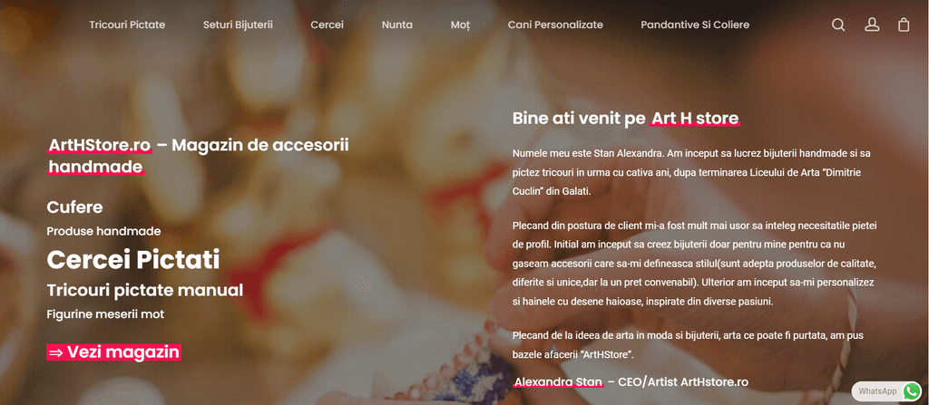
Text that is not a hyperlink is underlined and confuse users. The only clickable content is the button labeled "Vezi magazin".
3.3 Lack of visual hierarchy
The homepage has multiple competing text sizes and boldness, making it hard to determine the most important information at first glance.
The homepage requires a clear visual hierarchy and simplicity. Use compelling and clear headlines to communicate value and capture the interest of potential customers.
Additional opportunities
1 . Add Skip Link
Improve keyboard navigation for users to bypass repetitive content.
2 . Clearly and accessible vertical navigation
Reduce confusion and improve overall navigation.
3 . Ensure Keyboard Focus Visibility
Help keyboard users easily track their selections.
4 . Accessibility statement
Demonstrates a commitment to inclusivity, describes the efforts that have been made and the improvements to expect in the future.
Final thoughts
I have identified critical areas for improvement in my review of Art H Store's website. Addressing these issues will enhance the overall user experience, making the website more intuitive, accessible, and engaging for everyone.
Implementing these recommendations will ensure customer satisfaction and help Art H Store reach more potential customers.
Thank you for checking out my work!
